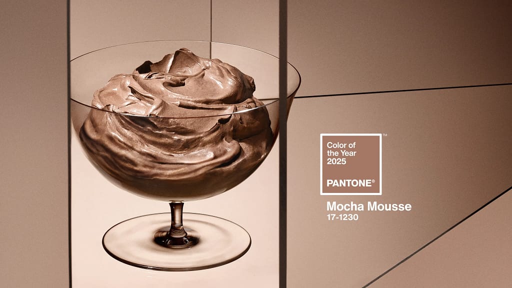
I am sure you have heard the buzz over the past month about the Pantone color of the year.
It won’t be a big surprise to you that I normally ignore that type of chatter and do my own thing.
But this year, I decided to go with the flow. I don’t always have to take the hardest path. Honestly, I don’t.
Ok maybe I do like a challenge. But we are talking about color, not my mental state.
The Pantone color this year is a lovely warm brown. It really does look good enough to eat. And as you know, I love my chocolate.
My first step was to find the color numbers so I could create it in EQ8. I found a wonderful website (get-color.com) that listed the color and loads of other helpful information.
From that site, I was able to get the color number (#a47764), which you can use in programs like Canva and Adobe to recreate.
The site also provided the colors in red, green and blue or rgb, which I needed to create the new color in EQ8. Mocha Mousse has an RBG (164, 119, 100) that means it is 64% red, 47% green, and 39% blue.
I could use this information to create the color in EQ8. Of course, it didn’t mean that I could easily find material to match it!
Creating Color in EQ8
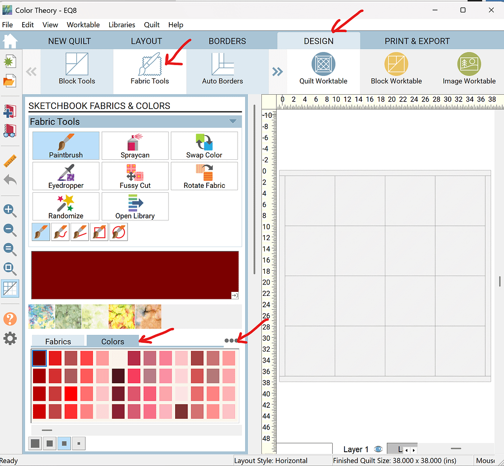
To make this color in EQ8, you click on “Design”. Then, click the “Fabric”. Then, click “Color”. Then, click the three dots near Color.
A pop-up window will appear. In this window, click “Add Colors”. That will bring up a new pop-up window that looks like this.
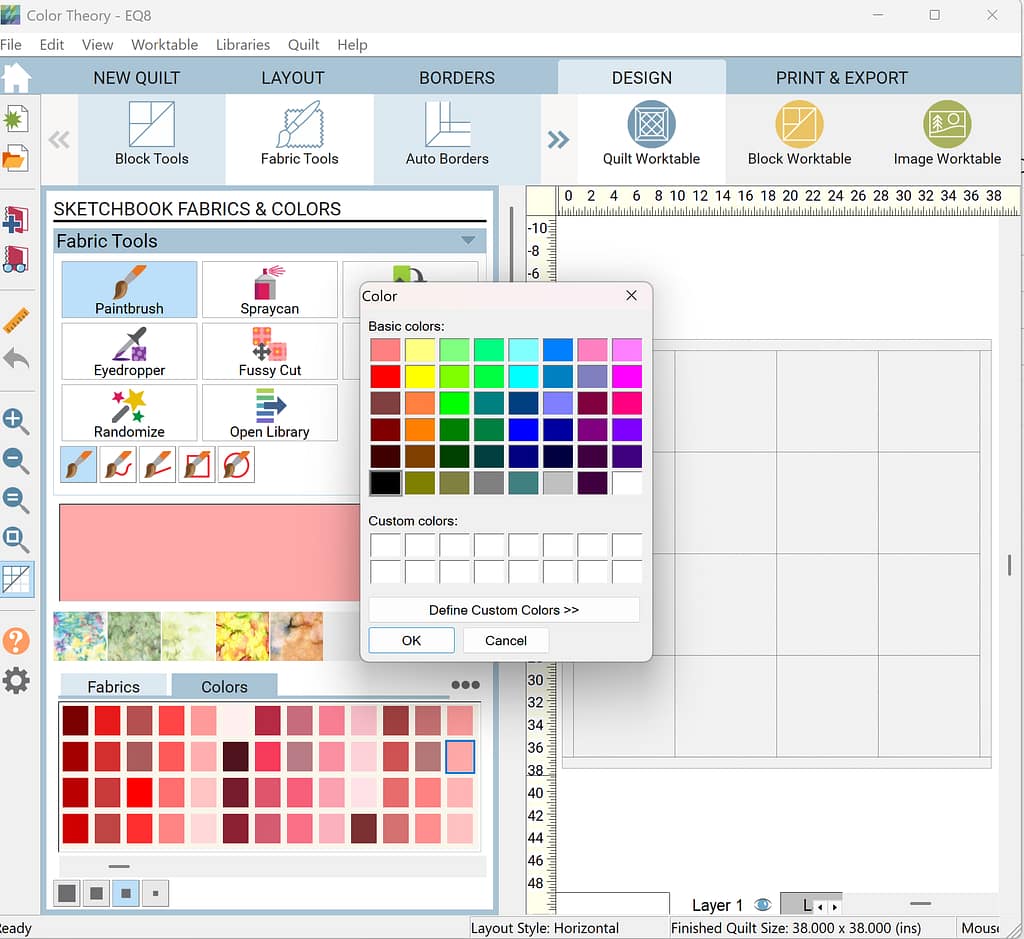
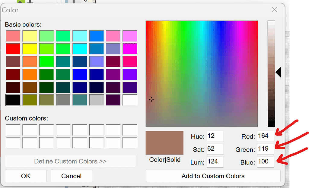
Then, click “Define Custom Color”. That will open yet another pop-up window.
In that window, type “164” in the Red box, “119” in the Green box, and “100” in the Blue box. The resulting color is shown to the left of those boxes as you can see here.
Then, click “Add to Custom Colors”.
If you want to add more colors, now is a great time to add them.
What colors should you add? Great question. The website I linked to earlier, has great suggestions.
It gave a “Color Palette”, “Color Scheme”, “Color Variations”, and “Color Tones.” Talk about a color gold mine.
Colors for Quilt
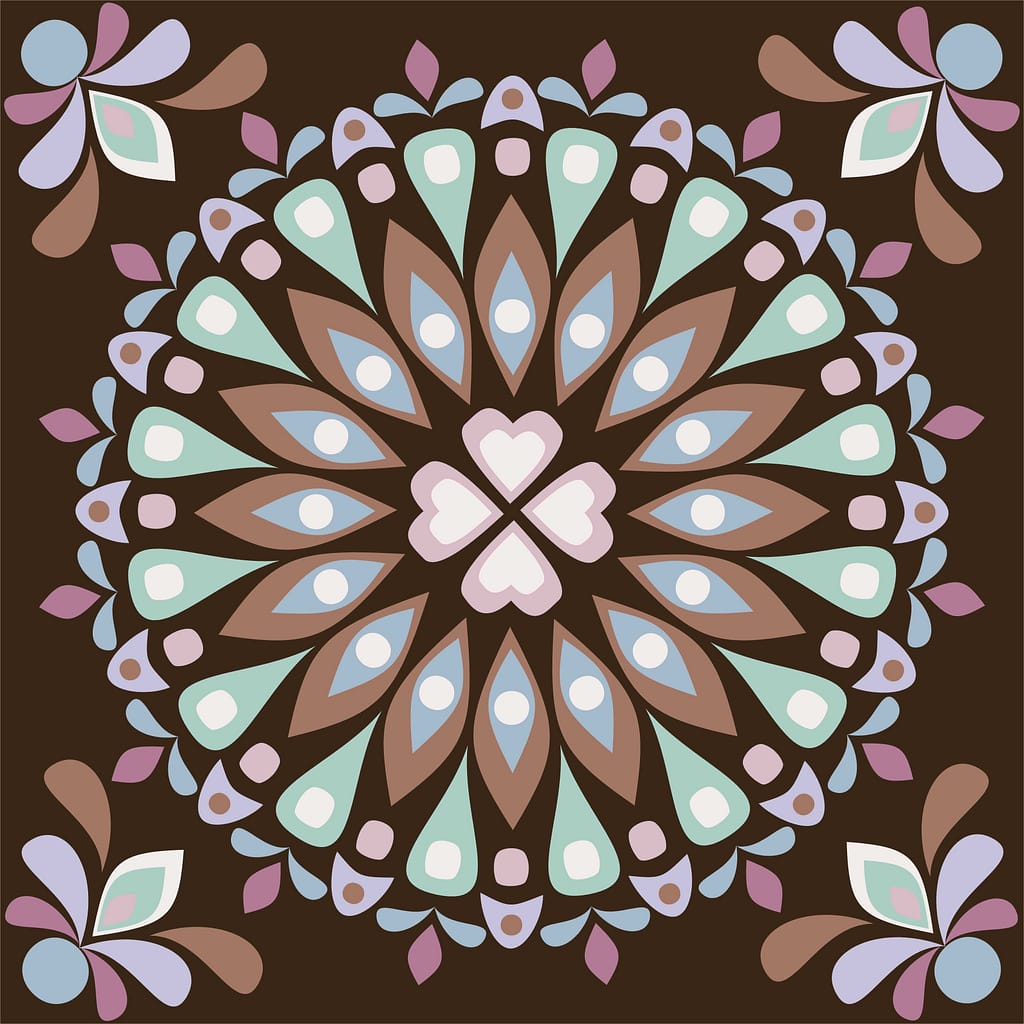
I created a bunch of colors from the “Color Palette” for the appliques in my Astral pattern. They are lavender, mint, light mauve, dusty blue, and cream. (Those are my names, not the official ones.)
Then, I added a shade from the “Color Variations” for the background of the pattern. This provided a dark contrast so the appliques would pop. It almost looks like dark chocolate.
I didn’t want the appliques to be too washed out, so I also included pink from the “Color Scheme”. That is the raspberry like color you see.
What do you think??
Should we find those fabrics and make this quilt?
I hope you enjoyed this adventure into the color of the year! If you want to know more about creating your own colors in EQ8, please fill out the form below.
Happy Quilting!

