Have you seen a quilt pattern you really like, but the colors or print are all wrong for you? I am sure you have. It is one of the reasons designers and fabric companies provide alternate colorways. Everyone has their own unique tastes.
You are tempted to purchase the pattern anyway and change the color scheme (the costume change), but you aren’t confident enough to make that change. Here are a few tips to help you audition that new fabric, which will make the pattern perfect for you.
First, you need to understand the two elements that are appealing to you. The first is the geometric design, which shouldn’t change as that is what the designer has created. The second is the color play. Color play is how the designer has helped you see the geometric design through the use of colors and their relationship with each other.
 There are three facets to color play, that you can change, but not their relationship to each other if you want to keep that visual effect you are seeing. Those three facets are hue, brightness (saturation), and lightness (value or tint).
- Hue means the color on the light spectrum or circle which include red, blue, yellow and everything in between. That is typically what people think of when you ask them their favorite color.
- Brightness is the saturation of that hue. Think of the terms muted versus bright or muddy versus pure. It is a matter of how much grey is mixed in with the color.
- Lightness is the depth of that hue. Terms of pastel and dark are often used to describe the lightness of a color, which ranges from the amount of white or black added to the color.
When auditioning a costume change for a pattern, you can change any of these, but you need to keep the relationships between them constant to keep the effect. Let me give you a few examples.
You like yellow but not purple or red but not blue. Here are four versions of the same pattern (Sweet Tea) in different hues. The brightness and lightness are the same. The only change is the color from yellow to purple to red to blue. The brightness is consistent, and the lightness (tint) is same. You note that the pattern looks the same.

 Let’s try changing the lightness. In this case, you invert light and dark. There are two ways to accomplish this. The first is simply substituting light for dark or dark for light. An example of this is Reach for the Stars. In this case, the light versions and dark versions of the collection were swapped for a different look of the same design. That happened for each place there was a distinct white (light) or black (dark) fabric. This is relatively simple when the other colors in the quilt are constant. In this case, all of the other colors were bright or pure hues. You can easily see the Red, Orange, Yellow, Green, Blue and Purple.

 But what happens if the quilt has a gradient of colors. In other words, the tint changes from light to dark as in Sweet Tea. This isn’t quite so easy to do the one-to-one substitution to change from light to dark. In this case, you need to keep the gradient consistent, switching each color along the gradient. Let me give you another example with Poinsettia & Pine. In this quilt, not only were the backgrounds switched. The dark red and red were substituted. The green gradient was reversed from light to dark. If you look carefully, you can see the light radiate either from the center of the pineapple or from the star. The gradients are reversed, but their relationship is consistent.
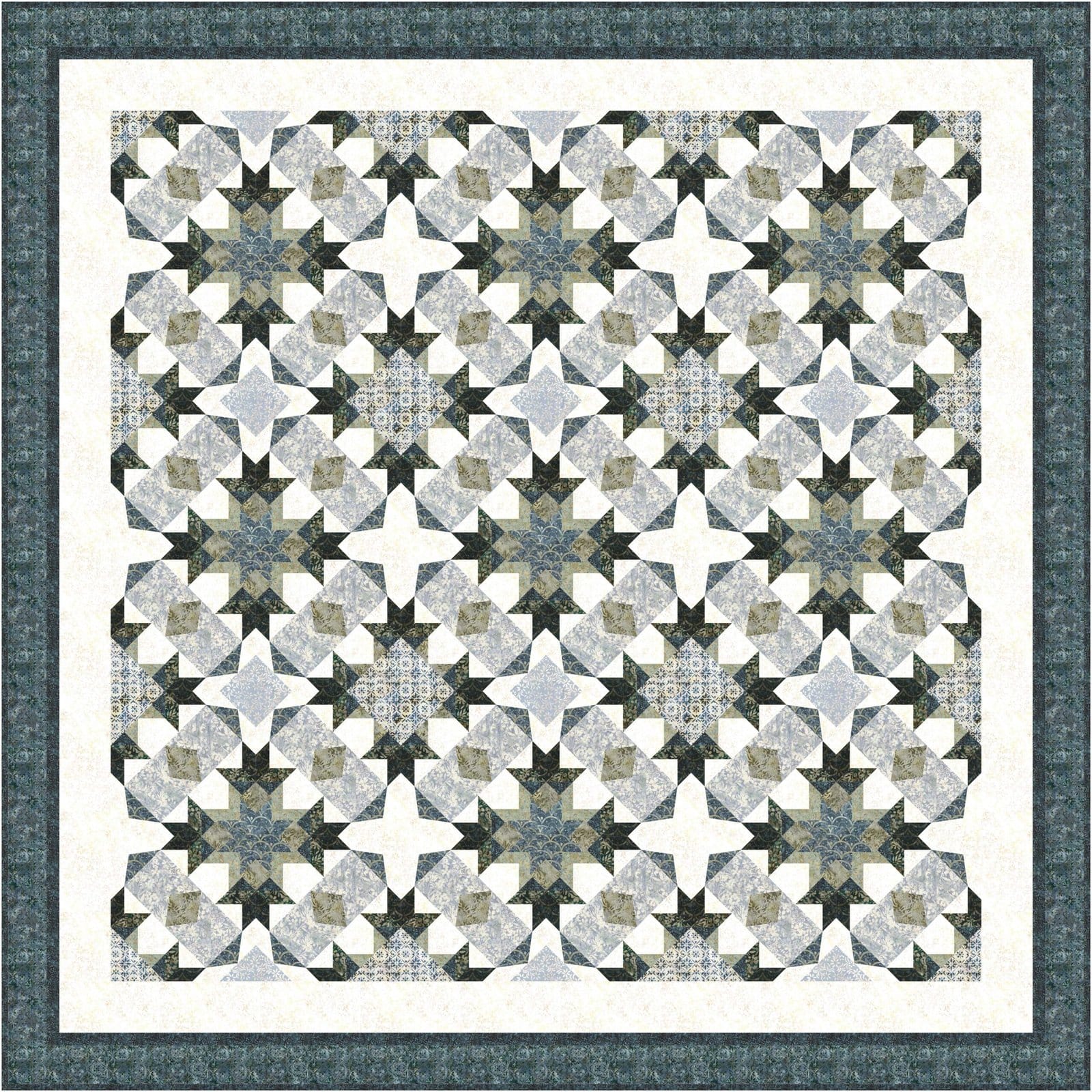
So far, the changes are pretty easy to discern. Changing the saturation is when things get a little more complicated. Up to this point the contrasts have remained constant so the impact of the geometric design has stayed the same. When you change the saturation, it also dulls or blends those lines, depending on your point of view. Unfortunately, I don’t have a clear example of this, but I have something similar. Let’s look at Lattice of Avalon. In this case, the saturation of the colors changes. The deeper colors don’t show as much contrast. The design gets a little lost in comparison.
 Changes in saturation occur most often when changing from solids to prints. The print is visible because different colors are added. Those colors when averaged mute the background. There are two ways to see this easily in your sewing area or the shop. Put a solid and a print with the same solid background next to each other. Use the registration marks on the selvedge edge of the print to do the matching. Then, step back several feet so the design is no longer prominent. You should see that the print looks “more muted” than the solid. Keep this in mind when picking your fabrics. Larger or busier designs add more colors for your eye to average, which will result in a “duller” contrast or a more blended look.

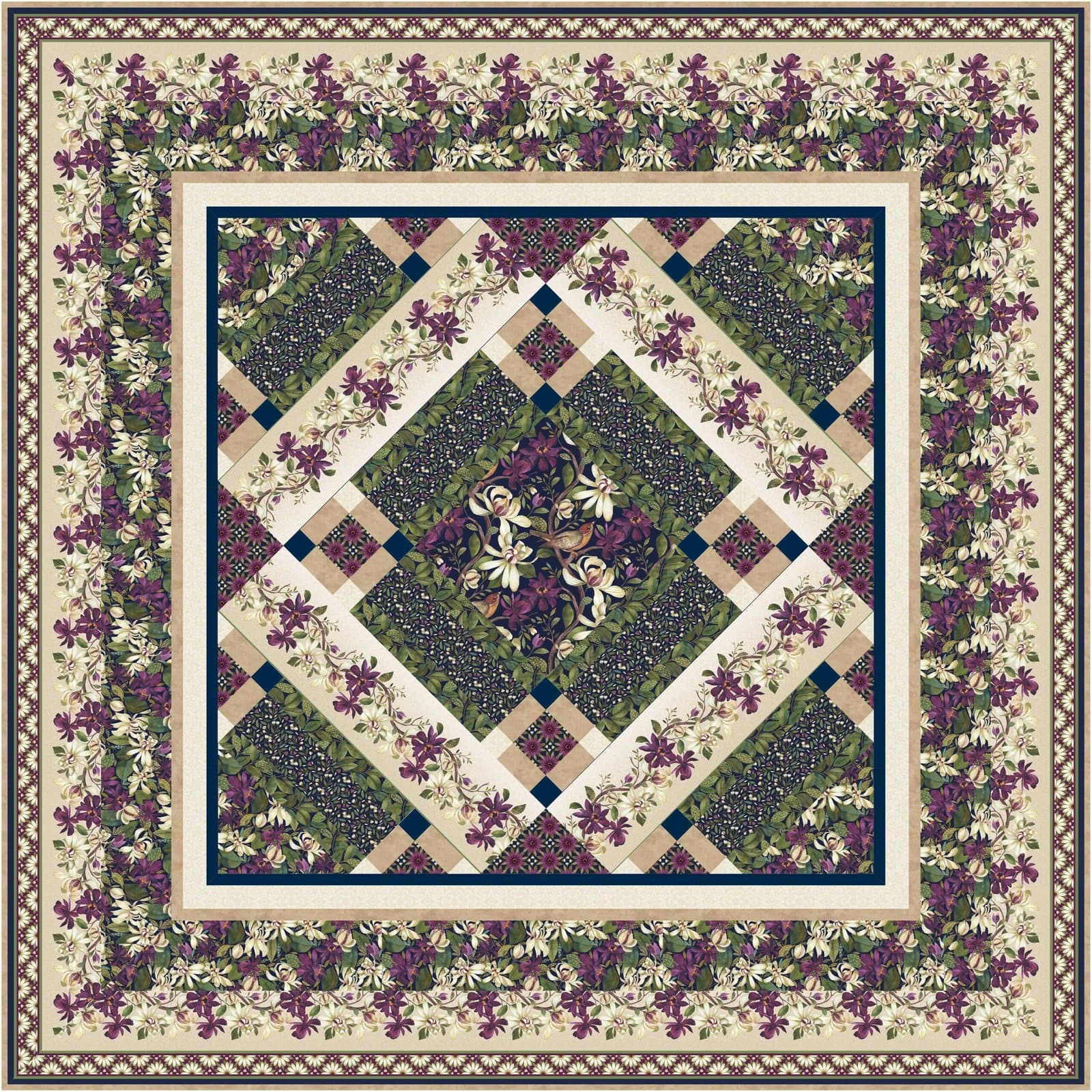
 When you change the relationship of these colors to each other, the design can look quite different. So that is when you really need to be careful. Using a coloring page will help you visualize what that change will really look like. Floral Points and Pearls of Wisdom are an example of where the same geometric pattern can look different. The color contrasts change, thus the pattern changes. These patterns have an obvious difference in hue (green vs red) and saturation (dull vs bright). But the relationship has also changed in the center of one block (dark pattern vs white) and the sashing (medium color vs white). It is those changes in contrast that change the image from prominently diagonal to circular.
One of the most important tools for costume changes is a fabric map. This is a visual tool that will help you as you cut and piece to quickly match the words to your fabric.
If you would like to know more about color play, watch for my new class “Color Play” coming in 2023.
Happy Quilting!
Laureen
