The Basics of Color Theory: Exploring the Traditional RYB Spectrum
Color is one of the most exciting parts of quilting and crafting, but it’s also an area where many quilters feel the least confident. Choosing the right colors can feel overwhelming—there are just so many options! But don’t worry—we’re here to help. In this color theory series, we’ll break things down step by step and help you see color in a whole new light. In this first part, we’ll explore the traditional RYB spectrum, originally introduced by Isaac Newton, and dive into how colors interact with light.
The RYB Spectrum: A Traditional Approach to Color
We all learned about color mixing in grade school, but how does that actually help us pick the right colors for our quilts? Eventually, we’ll explore how certain colors work together and why they create specific effects. But first, let’s start with the basics.
The RYB color model is built on three primary colors:
- Red
- Yellow
- Blue
These primary colors are the building blocks of color mixing because they can’t be created by blending other colors. When you mix them, you get secondary colors:
- Red + Yellow = Orange (Think autumn leaves or a warm sunset!)
- Yellow + Blue = Green (Like fresh spring grass or lush forests)
- Blue + Red = Purple (Royalty, anyone?)
Mixing further leads to tertiary colors—those lovely in-between shades like red-orange, yellow-green, and blue-purple that add even more richness to your quilt design.
Imagine you’re making a quilt inspired by a sunset. You could design a quilt that gradually moves from bright yellow, through orange to red as the sun is lowering below the horizon. Then, transition to pink, violet and blue to mimic a beautiful twilight sky! Nature gives us plenty of hints about what colors naturally look good together.
Understanding Color and Light
The RYB model is based on the way light interacts with objects, a concept that dates back to Isaac Newton’s prism experiments. Newton discovered that white light splits into a spectrum of colors, but what we actually see depends on how materials absorb and reflect light.
Think of it this way:
- Black absorbs all light, which is why it looks so deep and dark.
- White reflects all light, making it look bright and vibrant.
- Red reflects the red part of the spectrum but absorbs the violet end.
Picture a white silhouette on a black background and vice versa—where would your eye go first? The contrast creates a striking visual effect, naturally drawing your focus to the lighter shape against the dark background. What happens if you add red to that silhouette? Does your eye move differently to find the design?
It is actually that contrast between the light and dark that help us to see the shape more clearly. Just think about the trip to the eye doctor. The better the contrast, the clearer the image. So, so if you want something to be distinctive, use stark contrasts. If you want something to look softer or more subtle, transition your colors slowly.
Take a look at the two images below. They are the same design, but different backgrounds. How do your eyes react?


Also, consider how shadows work. Darker colors tend to recede and blend into the background, much like how objects hide in the shadows at night. If you’re looking to add depth or create a sense of mystery in your quilt, using darker fabrics can help achieve that effect.
If you want to highlight certain areas of your quilt, using brighter colors can be a smart strategy to catch the viewer’s eye effortlessly.
Today’s Focus: Hues, Light, and Saturation
Today, we’ve talked a little about hues, light, and saturation—key elements that influence how we perceive color and how they work together in quilting. Hues give us the basic color, light affects its brightness, and saturation determines how vivid or muted a color appears.
In the next part of this series, we’ll dive specifically into tint, tone, and shade—and how they can help bring your quilt designs to life.
Why the RYB Model Matters for Quilters
So why should quilters care about the RYB model? Well, it helps you understand how colors work together, making it easier to choose fabrics and create visually stunning compositions. But color theory isn’t just about what looks good—it’s also psychological. Different colors can evoke certain emotions or have cultural significance, which can affect how we perceive them in a quilt.
For example:
- Red can symbolize passion, warmth, or excitement.
- Blue often evokes calmness and serenity.
- Yellow brings a sense of happiness and energy.
Whether you’re aiming for bold contrast or a harmonious blend, color theory gives you the tools to achieve it. Plus, once you get comfortable with color, you’ll find it much easier (and more fun) to experiment with your quilting designs!
Stay tuned and happy quilting!

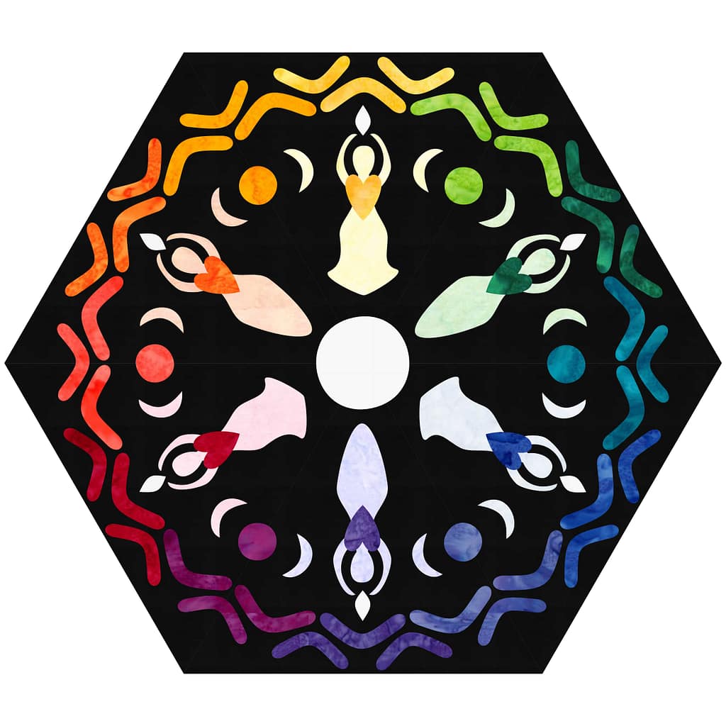
But when will we get to make the dancing ladies pattern? LOL it’s so pretty but I can’t find it anywhere.
I am working on the video and pattern write up. My goal is February!
Sweeeet!!! I can’t wait!