We spend so much time picking the perfect palette with our fabrics, but threads can make or break your quilting project. Thread choices are not just black and white. They cover piecing, applique and quilting, bobbins and top threads. So, you need to think holistically.
Piecing
Let’s start with piecing threads. These threads should be invisible when the work is done. This is accomplished partly with seams pressed to one side to hide the threads. Pressing seams open shows more of your piecing threads.
When sewing garments, we match the threads to the fabric to ensure they are hidden. In piecing, fabrics often contrast. That makes picking the thread color more difficult. If you match one of the fabrics, it will show against the other…So how do you choose?
It is not necessary to match them at all. In fact, it is recommended to keep to light and neutral colors like white, cream and grey.
Why? Because you can use fabric markers to color the threads if they happen to show through the fabrics. This is much easier than constantly changing threads.
There are a few occasions where a darker thread may be more appropriate. One example is when making a quilt with a black background. Here, it may be easier to use the black thread when piecing the black and colored fabrics together.
Of course, when talking about piecing threads, it does help if they match. It isn’t necessary. But certainly, makes it easier.
Applique
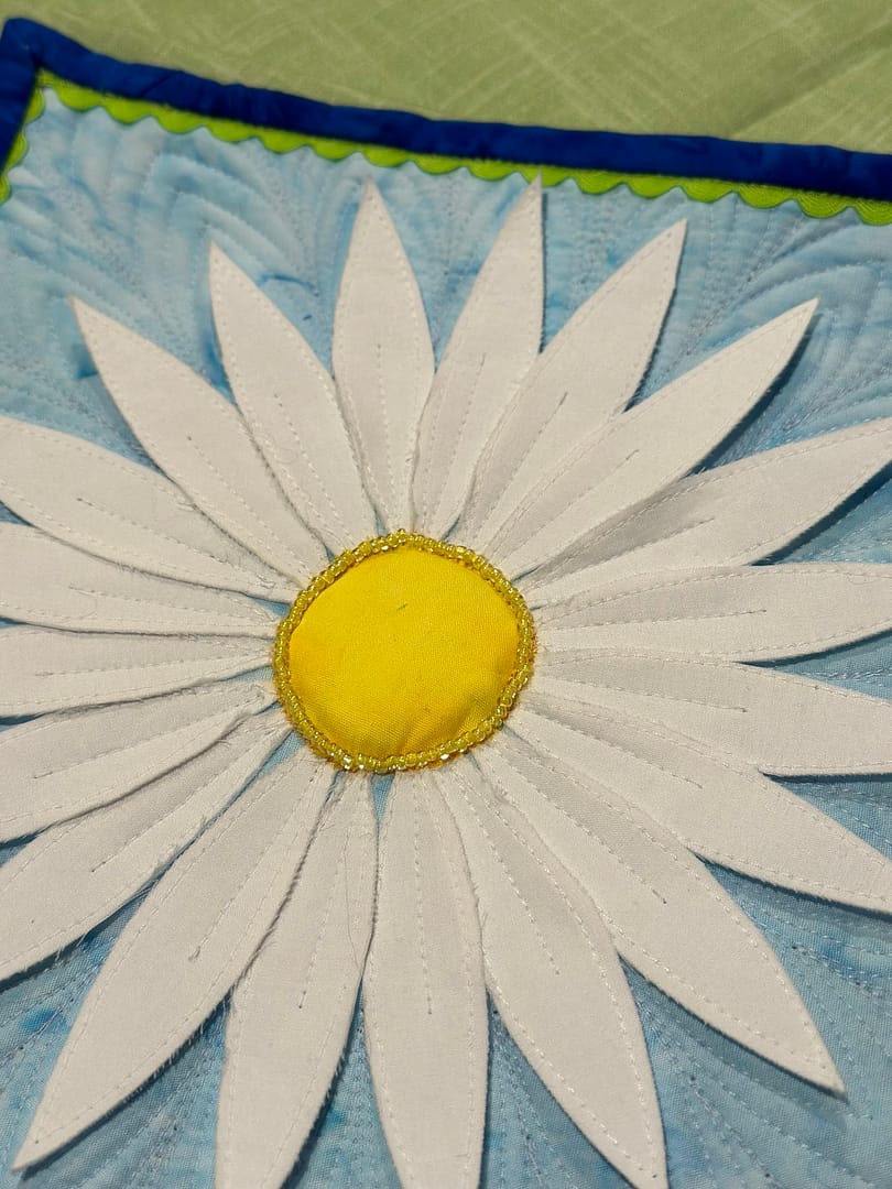
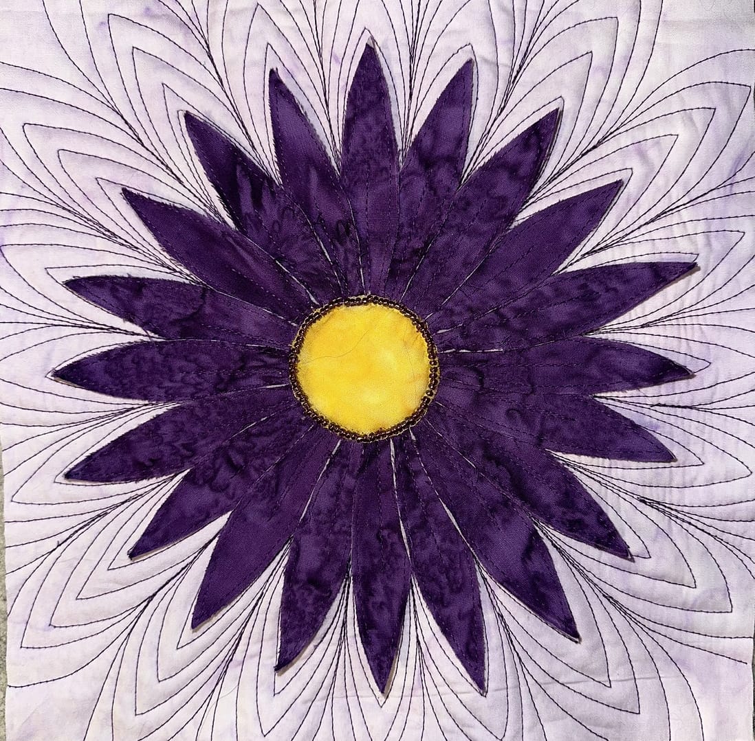
This is where you can start to have fun. There are three options for applique: blend, compliment or highlight.
Blending is much like piecing. This is best when you have a beautiful piece of fabric that should not complete with stitching. It is also good if you are not confident in your stitching. When you use a blending thread, the fabric gets to shine rather than the stitching. The applique stitching in these pieces blend quite well with the fabric.
Complementary is a bit like thread painting. It can be used to add depth to the fabrics or accentuate certain aspects of the fabrics. For example, adding faces to animals or details to flowers. To find complementary colors, you should utilize colors closest to them on the color wheel.
Highlighting is meant to draw attention to the applique. This is often accomplished by using dark, bold or contrasting threads to outline the applique. To find contrast colors, you should utilize colors opposite them on the color wheel.
Quilting
Quilting has lots of options as well. Blending threads create texture without competing for with fabric. Complementary threads can accentuate the piecing or overall design. Moreover, contrasting thread adds another dimension.
Keep in mind, that contrasting thread will catch your attention. So if there are any baubles, those will be noted as well.
Solid or Variegated?
As you consider your thread choices for applique and quilting, are you looking for solid or variegated? Most people chose solid threads.
However, variegated threads are a wonderful option. The trick to variegated threads is to ensure either all or none of the colors within the thread blend with the background fabric. If only a section blends with the background it will “disappear.” When it disappears, it leaves a visual “hole” in the quilting.
Bobbin vs Top
Most of us were taught to match the bobbin and top threads for a unified look. That is a good idea for piecing.
But it is not a rule! They don’t have to match each other. Many of my tops are light and backings are dark. I may use lighter threads on top and darker threads on the bottom so that they blend better. That may mean that blips of color from the bobbin show on the top and vice versa. This effect may be desired to make for more interesting quilting or detailing.
Regardless of the thread you use, make sure you choose one that is colorfast if it will be washed.
We hope this has been a little help in selecting thread colors. If you would like more information about color theory, stay tuned!
Happy Quilting!
