What are the first signs of spring where you live? I watch for the birds to migrate, the bunnies to come out of hiding, the turtles to rise from the muck, and certain flowers to bloom.
It probably is no secret that I love flowers. One of my favorite spring flowering trees is the redbud. It is a North American native tree that blends into the background most of the year. But in early spring, all of the branches are covered in these little red-violet flowers.
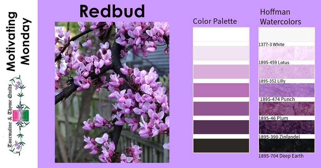
If you can, really blow this picture up. You can see the little white dots on the bark, the wine-colored flower stems, the tiny white stamens in the buds. These little blooms are a gradient of red-violet tone.
For those of you who are a little rusty on you color terms, tones are colors with a bit of grey added to them. Grey can make the color dusty if they are lighter or muddy if they are darker. Tints are when white is add to a color to make it lighter. Shades are when black is added to a color to make it darker.
Gradients are probably my favorite color scheme. Moving from light to dark or dark to light provides depth to a project.
This is a perfect example of that gradient in use. Both version of Garnet and Granite use the Redbud palette. I did add Hoffman’s 885-437 Pansy for the squares in each motif as I needed one more color.
They look a little different, depending upon how you use the gradients.


Does your eye move differently depending upon where the direction of the gradients? For the most part, your eye will move toward the light. The is one of the reasons it is easy for things to hide in the shadows.
Did you notice how prominent the “X” is in the middle image (C)? That is because of the sharp contrast between the dark and light. If you want sharper designs, use stark contrasts to define those edges. If you want them to be softer, like in the two right images (A and D), gradually change the gradient.
Which of these do you like best? Please let me know in the comments.
- Image A (upper right) – Light gradually moving to dark
- Image B (lower left) – Light stark contrast
- Image C (lower middle) – Dark stark contrast
- Image D (lower right) – Dark gradually moving to light.
Do you want to learn a little more about these palettes and how to use them? Stay tuned for more information on an upcoming class!
Happy Quilting!
@hoffmanfabrics #tourmalinethymequilts #TTQ #quilts #quilting #quilt #patchwork #quiltingtherapy #quiltfabric #sewing #quilttherapy #quiltpattern #quiltpatterns #machinequilting #quiltmaker #quiltpiecing #quiltfun #quiltsofinstagram #quiltypleasure #quiltersofinstagram #sewinspired #makersgonnamake #quiltlove #sewing #trustyourselfwithcolor #motivatingmonday #colortheory #Redbud #Garnet&Granite #Garnet&Granitepattern