Some places are just unforgettable, like Oia on the island of Santorini. The stucco buildings perched on the steep slopes. The only transportation through the “streets” is by foot. They are really just sidewalks and stairways. It was simply magical.
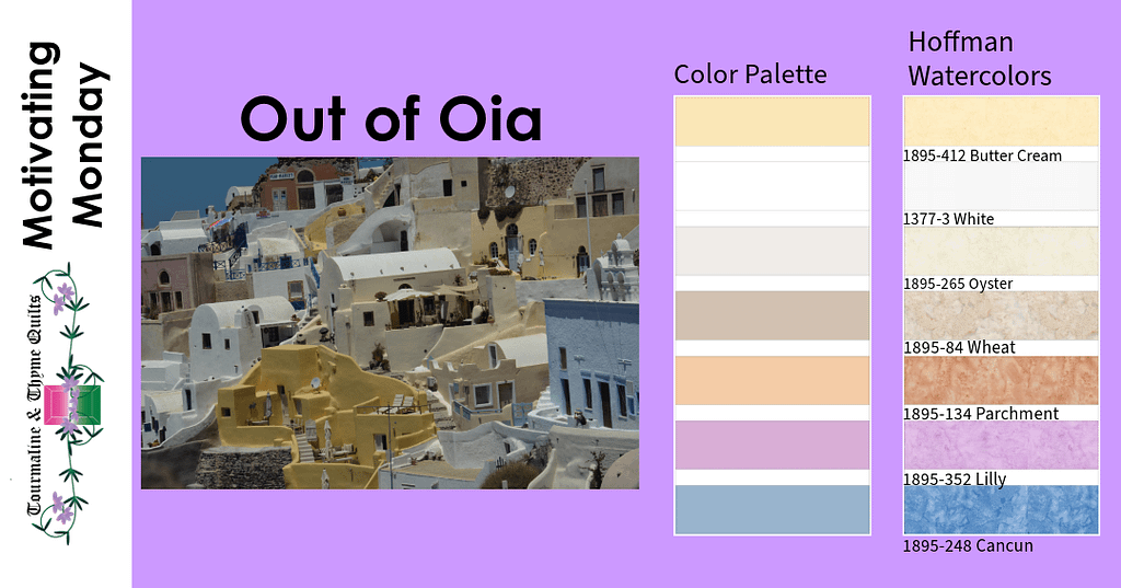
I chose someplace unforgettable to share a piece of magic associated with these palettes.
Start by looking at the photo and notice which colors I captured. I tried to pull the ones that were the most prominent or caught my eye. You will note the palette doesn’t have the dark colors for the windows or some of the browns from the stone. But I could use those as accents later.
Now, notice how much of each of these colors is in the image. It is mostly the light neutral colors, with a sprinkling of the rose, orange, and blue, right?
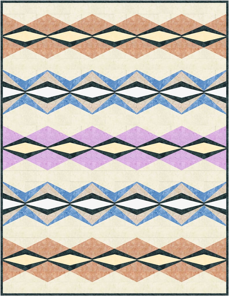
That is how I used them in the Bangles and Beads quilt. The neutrals are the main colors. The purple, orange and blue are larger pieces. Then, the dark from the windows openings are just an accent on the quilt. I tried to keep the proportions of the colors the same between the picture and the quilt!
That is one of the tricks for using images as inspiration. If you like the colors in the images, it may also be the ratio of those colors that is important. I could have used more of the rose, blue and orange, but it would not have “felt” the same as picture.
Are you really starting to like this technique? It is kind of magical – like Oia.
Happy Quilting!

Love the way you play with color! The rosie sand color is my fav. We’ve been to Santorini, it felt like I’d gone to sleep ad had a magical dream! Well Done!!!!!
Santorini is one of my favorite places!
I love playing with color 😊