
Sun King
There’s something about red that calls to me.
It doesn’t whisper. It shouts. It struts into the room in heels and lipstick and dares you to look away. And in quilting? Red doesn’t just sit there—it commands attention – like a Sun King.
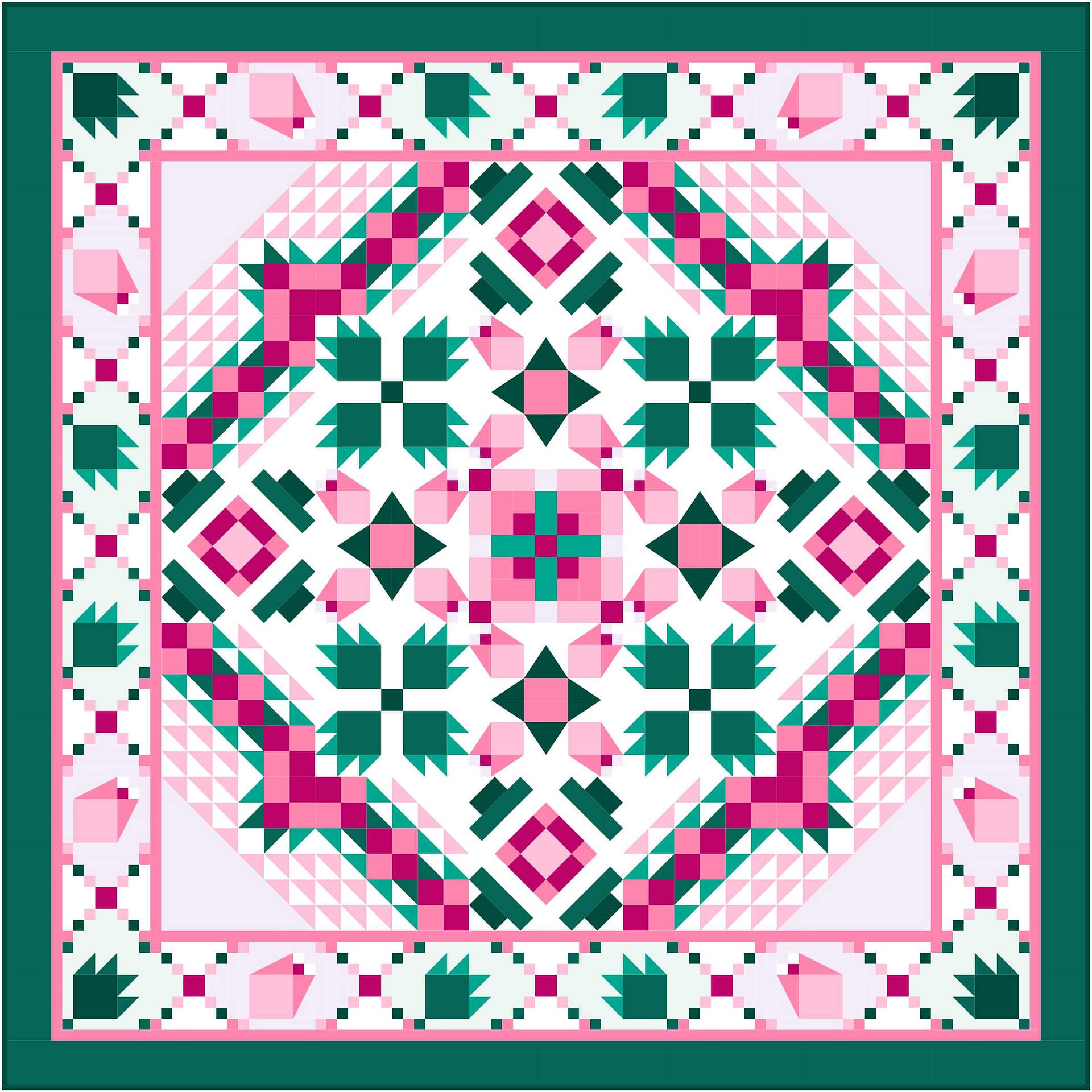
That’s exactly why I designed In Formation, a bold, graphic flying geese quilt that lets red take center stage. Paired with my new Radiant Red Fat Quarter Bundle—a curated collection of 16 analogous batiks from Hoffman, ranging from red-orange to red-violet—this confident beginner pattern shows off red in all its glowing, gradient glory.
But before we get to the stitching, let’s talk color theory. Because this isn’t just red for red’s sake—this is red with intention.
What Are Analogous Colors, Anyway?

In Formation – Charcoal

In Formation – Oyster

In Formation – Black Grape
Analogous colors live right next to each other on the color wheel. Think sisters, not strangers—close enough to harmonize without clashing. When you use analogous colors in a quilt, you get a gentle sense of movement and cohesion, even when the palette is bold.
In the Radiant Red bundle, we travel from spicy red-orange to sultry red-violet, touching all those smoldering tones in between. The beauty of this approach? The colors naturally blend without getting muddy, creating a smooth ombré or watercolor-like effect
Why Your Eye Is Drawn to Red
Fun fact: your brain literally can’t ignore red. It’s the first color infants see clearly. It’s used in stop signs, fire trucks, and lipstick tubes for a reason—red signals urgency, passion, love, and sometimes danger. That makes it a natural focal point in your quilt.
That’s why In Formation works so beautifully with this bundle—it lets red lead the charge, while neutrals like cream, charcoal, or black grape (a moody deep purple) step back just enough to let the reds do their thing.
Sweet Tea – Pink
Red in Color Schemes: A Crash Course
Red can be spicy, sweet, or downright dramatic—it all depends on how you mix it. Here’s your red remix cheat sheet:
🧵 Complementary: Red + Green
Think Christmas—but not just pine and poinsettia. Try sage and coral for something softer, or go retro with cherry and lime for a sassy 1950s vibe. Want classic and cozy? Pair evergreen with wine and call it a day.
This version of Sweet Tea shows how a red-adjacent hue like pink can soften green pairings for a more romantic, vintage look.
Goose in the Pond
🎨 Triadic: Red + Yellow + Blue
This is your primary-color power trio. It’s bold, nostalgic, and best handled with the 60-30-10 rule:
- 60% red (dominant)
- 30% blue (secondary)
- 10% yellow (accent)
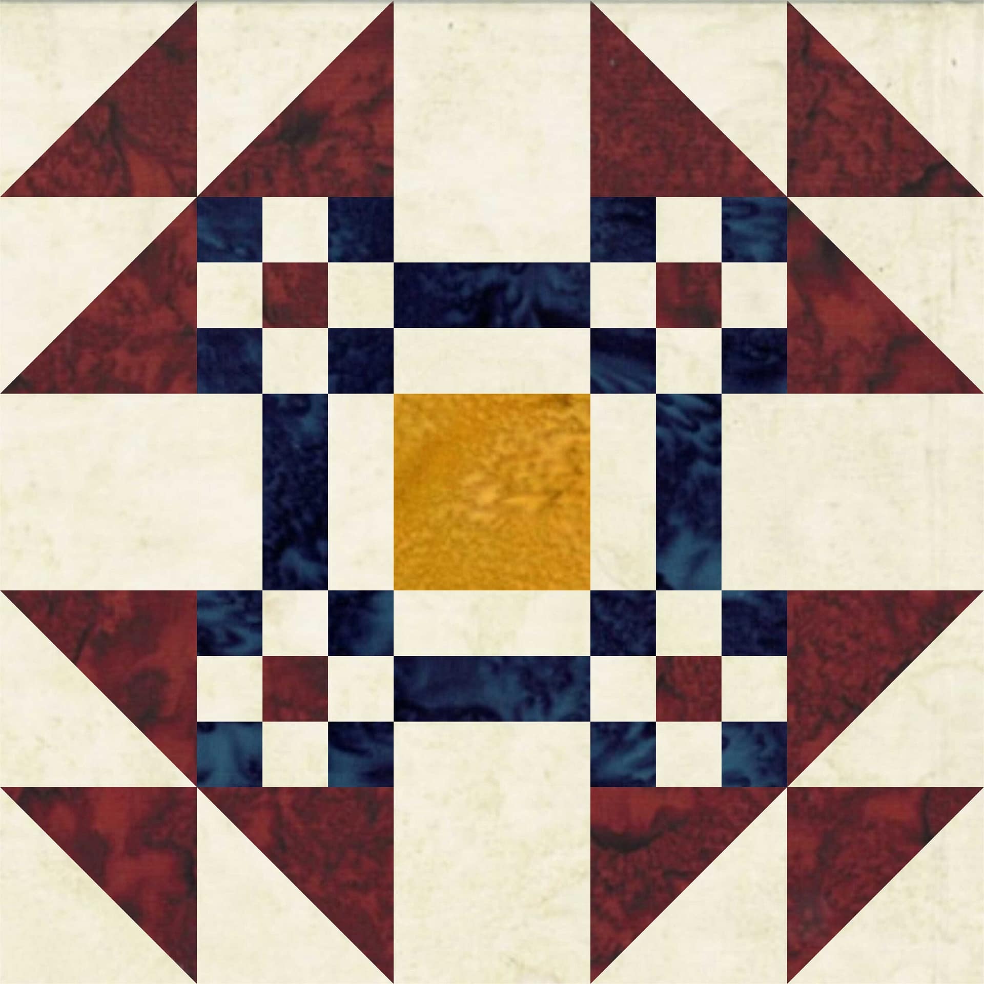
Want to dial it down? Tint it: pink, baby blue, and soft yellow make for a sweet, airy feel. Or deepen it with burgundy, gold, and navy for a sophisticated look, as shown in Goose in the Pond.
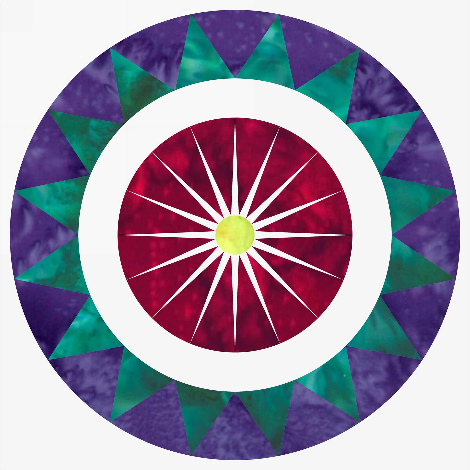
Prairie Point Sun
🟦 Square/Rectangle: Red + Blue-Green + Yellow-Green + Purple
This one brings balance through complexity. Try a 60-15-15-10 ratio to let red shine without overpowering the rest.That bold center? Total red spotlight. The outer ring and midtones? Harmonious balance.
Designing with Red: Tips & Tricks
✔ Use red to draw the eye—place it strategically in blocks you want to highlight.
✔ Pair it with neutrals—black adds drama, grey modernizes, and cream softens.
✔ Play with value—use light, medium, and deep reds to create depth.
✔ Don’t compete with it—red is a soloist. Let the supporting colors be backup singers.
✔ Use it like punctuation—a pop of red in a neutral quilt is like Rudolph’s nose on Christmas Eve: unmissable and totally charming.
About the Pattern: In Formation
This confident beginner quilt finishes at 61″ x 81″, making it the perfect throw or twin-bed topper. Flying geese march in tidy rows across the quilt top, each featuring a rich gradient of reds that mimics movement and adds depth.
It’s strip-friendly, stash-busting, and made easier with Creative Grids’ Ultimate Flying Geese Ruler—my go-to for sharp, drama-free points.
🧵 The pattern is FREE with the Radiant Red bundle, but if you’re stash diving or want to make a different colorway, the pattern is also available solo—on sale through August 4.
Limited-Time Offer 🧵❤️
Now through August 10, grab the Radiant Red Fat Quarter Bundle—16 luscious batiks curated straight from Hoffman’s rich red palette. It’s perfect for this quilt, but also a stash superhero when you’re low on red (which is always when you need it most).
Choose your favorite background (I used black for boldness) and let red remind you what passion looks like in stitches.
Final Thoughts
If you’re as smitten with the color red as I am, you don’t have to stop with one quilt. I’ve bundled together eight red-forward patterns — each one shows how this bold color can take the lead, whether as fiery focal points, dramatic accents, or glowing layers of contrast.
👉 Take a peek at the Radiant Reds Pattern Bundle here and see which quilt speaks to you first.
Whether you’re craving heat, movement, or a quilt that says something, red is your ride-or-die. And when you line it up just right, red isn’t just a color—it’s a statement.
So go on. Be radiant. Be bold.
And get your geese In Formation.