Color gradients are some of my favorite palettes. They provide depth easily.
But sometimes, they those colors are difficult to match with existing fabrics. Not to worry, this is when close is good enough.
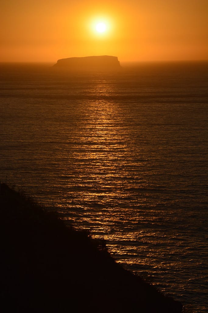
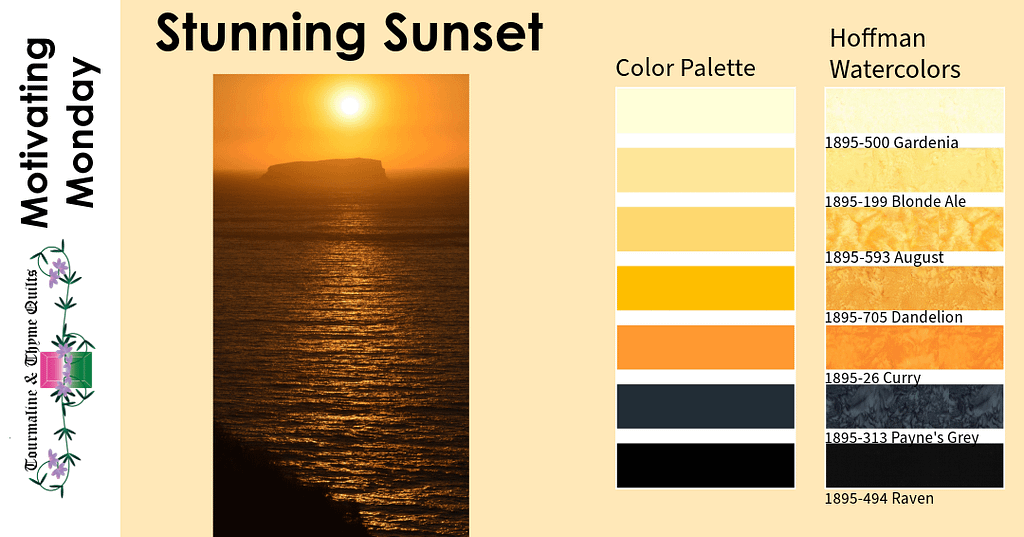
In this case the center of the sun, was a pale yellow while the outer edges of the sky were yellow-orange. I found three other fabrics that fit easily between them. I wasn’t possible to pick just one from the shading.
The other issue was the contrast color. The black was simple, but the lighter color in the sea was black with orange highlights. I had to settle for a greyish color there. It works because it shows the highlights rather than an exact match.
This is when it is important to understand that a fabric can give the illusion of light, like the reflection of the sun in the waves.
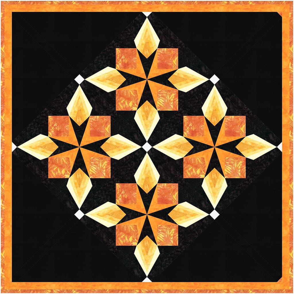
One of my favorite gradient quilts is Garnet and Granite. I guess here it would be more accurate to call it Citrine and Onyx!
For this quilt, White was used for the cornerstones, while 884-152 Tangerine was used for the squares. Tangerine works well because it blends the yellows and oranges.
We hope you are enjoying these color palettes and hints for using them. More to come.
Happy Quilting!
