Color Choices for Winter Whispers
When you see blue, how does it make you feel?
Calm and cool?
Sad?
Trusted and protected?
Hopeful and healed?
Blue carries a wide range of emotions, which is one of the reasons I’m so drawn to it for winter projects.
For me, blue immediately brings to mind crisp skies over snowcapped hills, blue ice crackling over winter streams, and the quiet calm of a winter day. That sense of stillness and reflection is what inspired the color direction for Winter Whispers.
But not all blues are created equal.
Bright blues, like Heirloom Cobalt, tend to feel confident and clear.
Teals, like Winter Tide, lean toward renewal and introspection.
Powdery blues, like Nantucket Mist, feel soft, open, and serene.
-
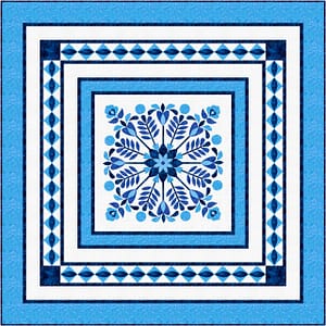
- Heirloom Cobalt
-
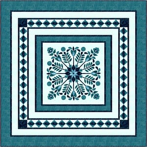
- Winter Tide
-
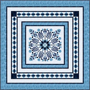
- Nantucket Mist
These quilts all use the same pattern, but the different blues shift the mood dramatically. The design stays the same — the feeling changes.
The key is choosing the blue that best suits you or the space where the quilt will live.
If These Blues Feel “Too Blue”
If one of these palettes feels a little too cool for your taste, there are easy ways to gently warm things up without losing the calm, winter feel.
One option is to add orange to raise the energy. Don’t add a lot — think back to the 60:30:10 rule we talked about earlier. This is that 10. A little warmth goes a long way.
If you want something slightly more vibrant while still keeping the design balanced, you can also introduce small amounts of red and yellow. These colors draw the eye quickly, so use them sparingly and place them consistently throughout the quilt to maintain the symmetry of the design. A good way to add these may be through embellishments.
You can see both approaches in the Frosted Branches examples below — one using a touch of orange, and one using a restrained triadic mix.
-

- Frosted Branches Monochromatic
-

- Frosted Branches Complementary
-

- Frosted Branches – Triadic
You can also tone down the monochromatic mood by adding more neutrals, like black or white.
When working with complementary or triadic color schemes, one simple guideline helps everything stay harmonious: keep the values similar. If you’re replacing a medium blue, replace it with another medium-value color. This keeps the overall balance intact, even as the colors change.
Make It Yours
The beauty of working with value-based color choices is that you can substitute fabrics one-for-one without redesigning the pattern. Start with the feeling you want, choose colors that support it, and adjust gently.
And if one of these palettes fills a gap in your stash, I’ve put together fabric bundles to make that part a little easier.
Happy Quilting!

