 From monochrome to analogous: how placement and concentration change everything
In my last post, I’m So Blue, we explored how different blues can shift the mood of a quilt — and how a small pop of complementary or triadic color can gently warm things up.
But what if you don’t want contrast?
What if you just want a subtle change, not a makeover?
That’s where the color wheel comes into play.
Green and violet sit on either side of blue. Staying close to blue — instead of jumping across the wheel — lets you change the feeling without disrupting the calm. You’re not adding drama through contrast; you’re nudging the mood by choosing a direction.
And here’s the important part: this isn’t just about color choice.
It’s about color placement.
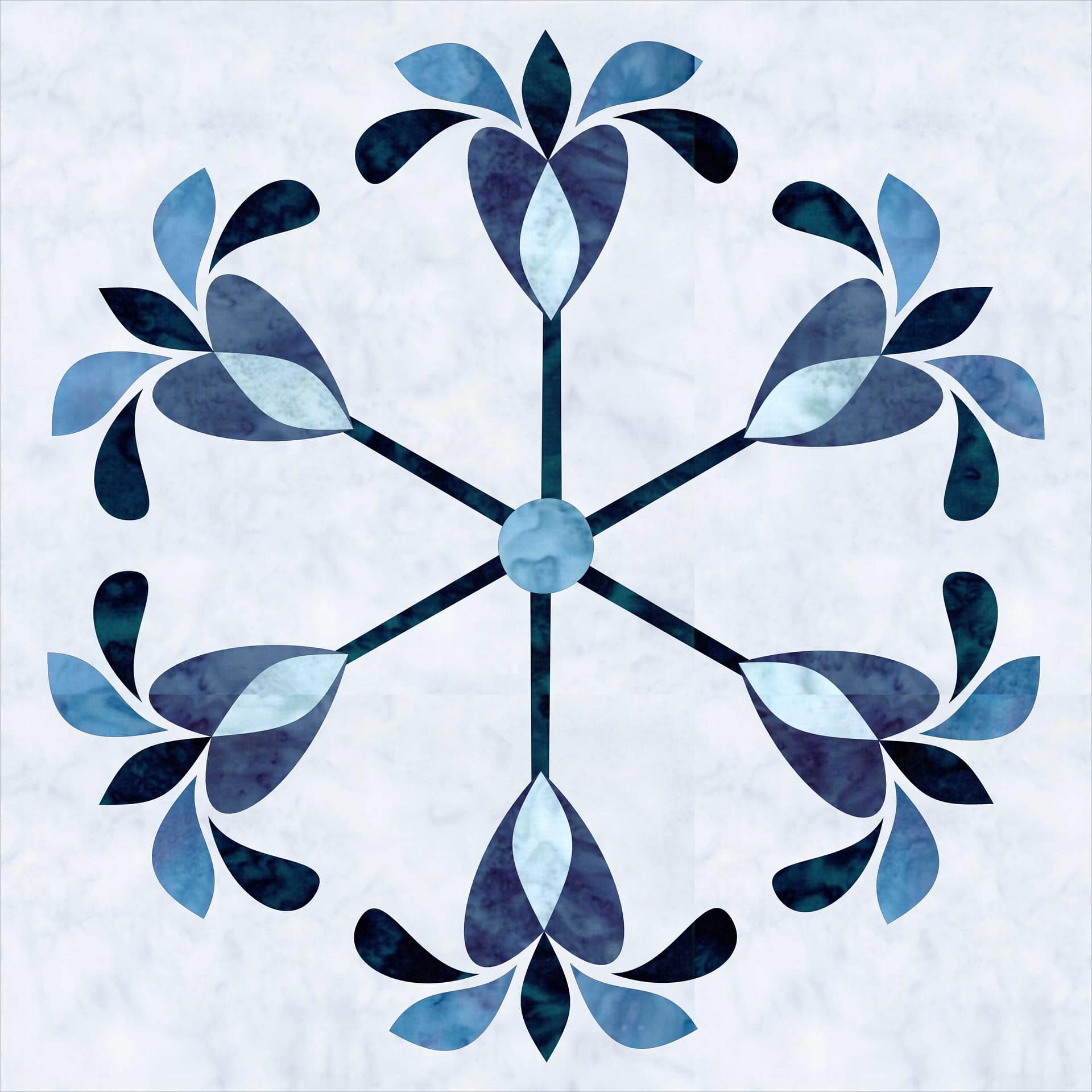
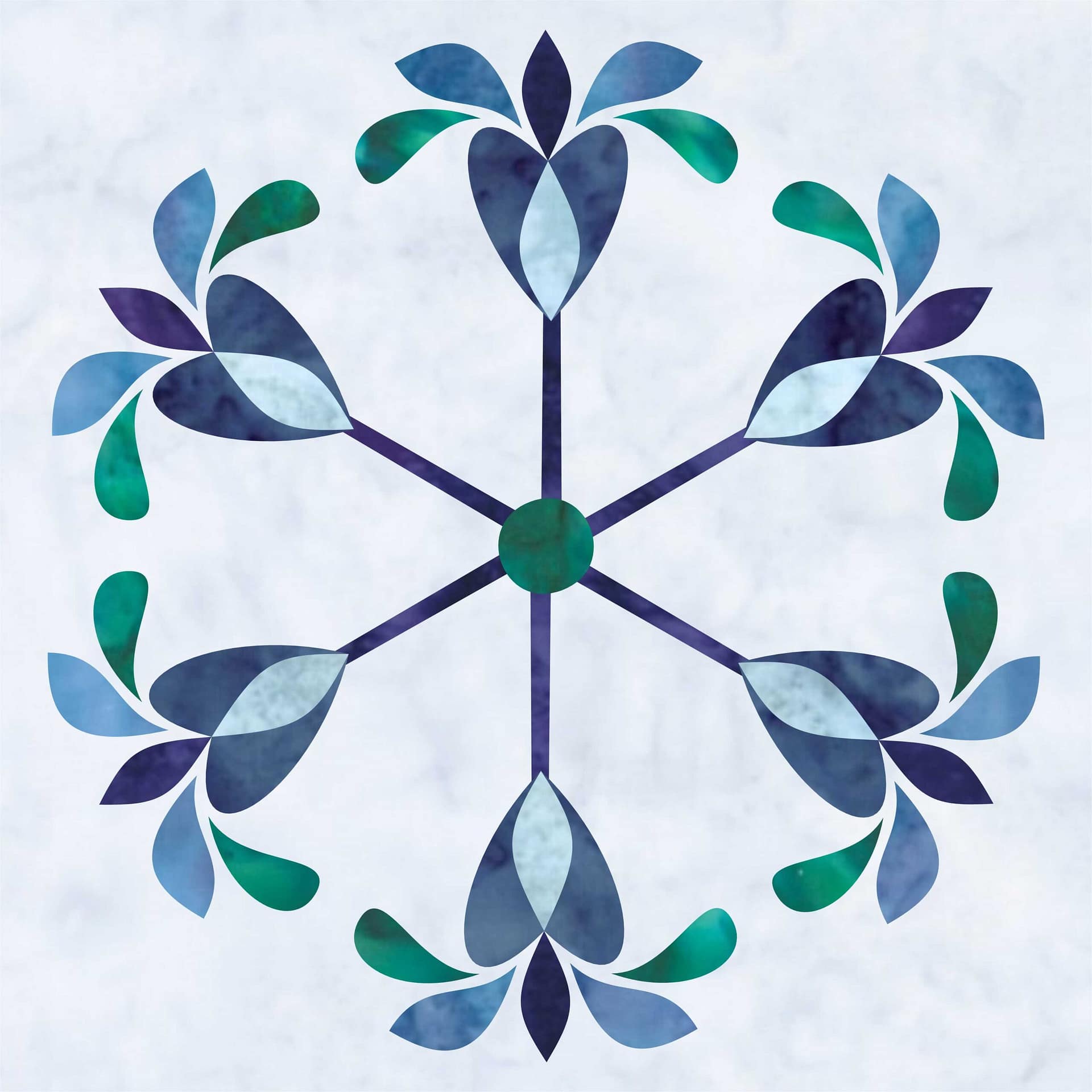
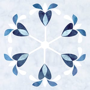 A quick reminder: 60:30:10 still applies
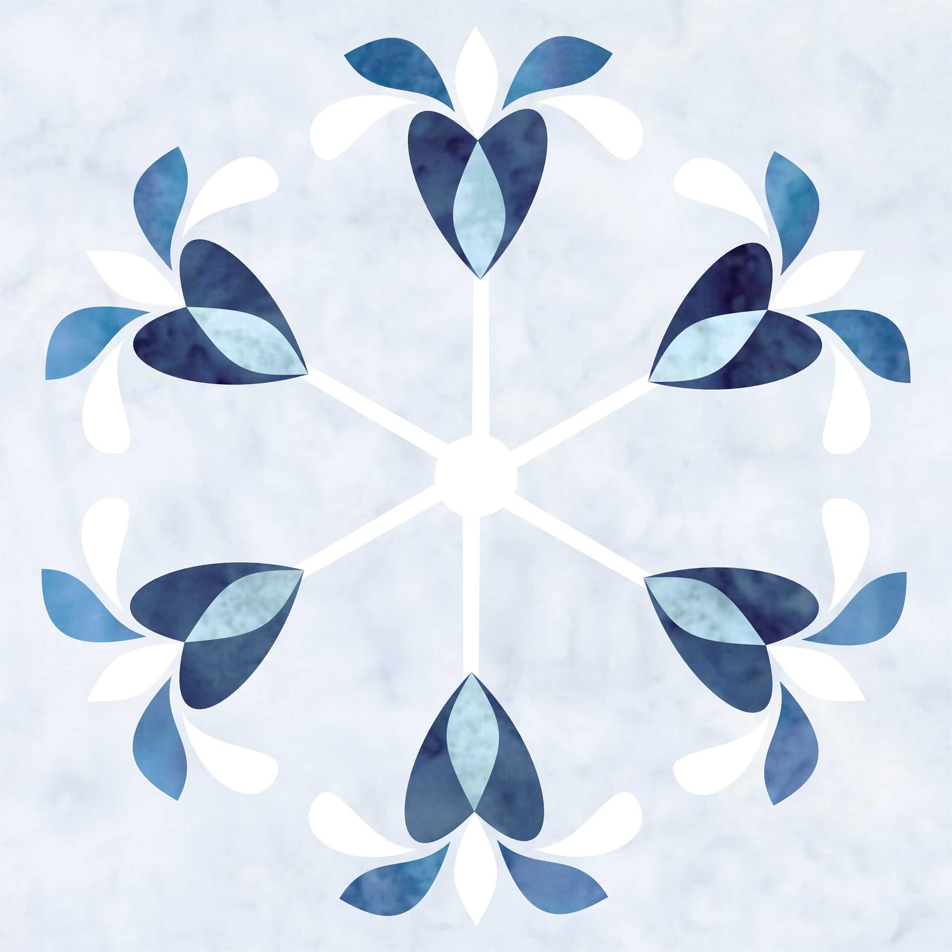
Before we talk about green or violet, let’s ground this in the 60:30:10 rule.
Blue should remain the dominant color — the anchor for the piece.
In this block, that means using blue for:
-
the heart
-
the almond inside the heart
-
the middle set of petals
These shapes carry the most visual weight. They repeat consistently around the block and form the core structure. Keeping them in the middle and lighter blues ensures the quilt still reads as blue-first, no matter what else changes.
The design stays stable because the anchor stays put.
Where the mood shift happens
The mood changes in the 30% — the secondary color.
In this design, that role belongs to:
-
the outer petals
-
the center circle
These shapes sit in two high-impact locations: the perimeter and the focal point. The outer ring is visually substantial, and pairing it with the center keeps the color story cohesive. Changing the color here has influence without overpowering the design.
This is where analogous color does its work.
The highlight: movement without competition
The 10% acts as a highlight.
The spokes — the stems and the small center petal — function as connectors. They guide the eye, create movement, and provide structure without competing for attention. Because these shapes are narrow and dispersed, they support the design rather than define the mood.
This is where a common misunderstanding clears up:
Concentration is not saturation.
A color doesn’t need to be bright or bold to matter. What matters is how much of it appears at once — and where.
Two subtle shifts, two very different moods
With the structure set, the only remaining choice is direction.
Both green and violet are analogous to blue. Neither one overwhelms the design. But each shifts the mood in a distinct way.
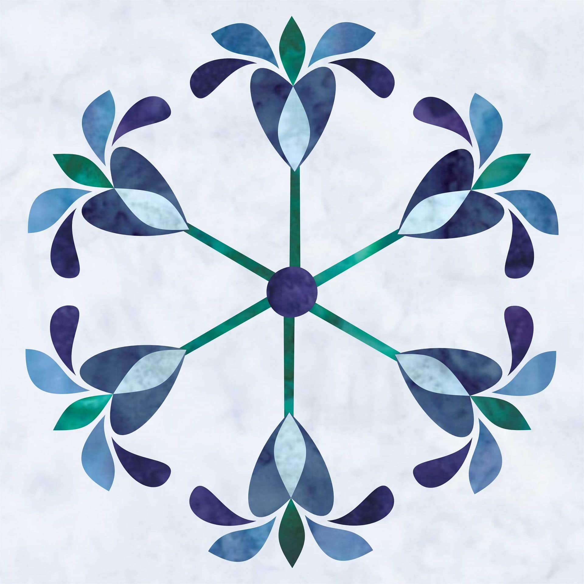
Blue + Violet: a turn toward dusk
When violet becomes the secondary color — that visual 30% — the mood deepens.
The quilt still feels cool, but it moves toward something quieter and more contemplative. Violet pulls the eye inward, adding a sense of evening light and gentle drama. The design feels like late winter at dusk, when the sky darkens and the world grows still.
Nothing about the structure changes.
Blue is still doing the most work.
But the feeling becomes richer and more introspective.
Blue + Green: a hint of spring
When green takes on the secondary role, the mood shifts in a different direction.
Green brings a sense of renewal and quiet optimism. Paired with blue, it suggests early growth — like Siberian irises pushing up through cool soil in spring. The quilt remains calm and balanced, but now there’s a subtle sense of movement and life.
Again, blue remains the anchor.
The change comes from where the green appears, not how much is used.
Same rule. Same block. Different story.
This is the power of analogous color.
You don’t need more contrast.
You don’t need brighter fabric.
You don’t need to redesign the block.
By keeping blue as the anchor and changing the secondary color, you can guide the mood — from dramatic dusk to hopeful spring — while preserving the quiet, cohesive feel that makes monochrome quilts so appealing in the first place.
Happy Quilting 🙂
Love the pattern beautiful ❤️
Thank you so much, Sheela! I’m so glad it resonated 💙
My schedule has not permitted me to see any of the live sessions. Is there a link so I might view the recorded version?
I email links to those who have signed up. I will do the same for all the Pillow Talks and Quilt Alongs.
You can register here (https://tourmalinethymequilts.com/winter-whispers/)