How to keep the same look and feel — even when you change the colors
One of the easiest ways to set ourselves up for a quilt we’ll love is to pause and think about color balance before we start stitching.
Not in a complicated, abstract color-theory way.
And not with stacks of heavy bolts or half our stash strewn across the room.
Just a few simple guidelines that help avoid surprises later.
Most quilters aren’t designing quilts from scratch. You’re working from a pattern, a fabric bundle, or that one print you absolutely fell in love with and need to use somehow. That’s often where doubt creeps in — and why kits are so popular.
So let’s break this down into a few simple, reliable checks you can use with any quilt to keep the same overall look and feel — even when you change the colors.
No art degree required.
Step 1: Ignore the Colors (for a Moment)
Before deciding what colors to use, it helps to look at value — how light or dark the fabrics are.
A quick trick:
-
Look at the quilt in black and white
-
Or squint until the colors blur
Then label the fabrics as:
-
Light
-
Medium
-
Dark
This balance matters more than the specific colors themselves.
If everything lands in the medium range, the design will feel muddled and hard to read — whether it’s piecing or appliqué. The only time an “all-medium” approach really works is in intentional gradient quilts, where softness is the point.
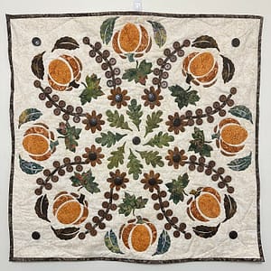 Harvest Medallion Example
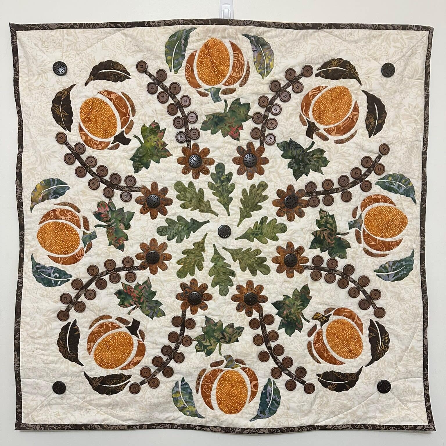
In Harvest Medallion, the value structure is very clear:
-
The background remains the dominant area — about 60% of the quilt
(light in the original version, dark in some alternate colorways) -
The motifs (leaves, pumpkins, vines) sit mostly in the medium range — about 30%
-
A few darker accents are scattered throughout — about 10%
That contrast is what lets the design breathe.
You can change the colors completely, but if you keep that same light / medium / dark relationship, the quilt keeps its clarity.
Step 2: Sort Colors into Buckets (Not Specifics)
Now we can talk about color — but still simply.
Most quilts (unless they’re extremely scrappy) naturally fall into three color buckets:
-
A dominant color (about 60%)
-
A support color (about 30%)
-
An accent color (about 10%)
This is where the familiar 60:30:10 idea comes from — but think proportion, not a strict rule.
And yes, this mirrors the light / medium / dark balance.
What This Looks Like in Practice
In the original Harvest Medallion:
-
The dominant bucket is the background and overall neutral tone
-
The support bucket is the foliage and pumpkins — browns and oranges
-
The accent bucket is small pops of green from select leaves
You don’t need to name every fabric.
If you see five different browns, just call them brown.
The goal is to preserve:
-
Which color is doing the heavy lifting
-
Which color supports
-
Which color adds sparkle or spice
Step 3: Translate — Don’t Redesign
This is where many quilters get stuck — and where a little permission goes a long way.
You don’t need to recreate the exact colors to get the same feel.
Instead:
-
Identify the role each color is playing — dominant, support, or accent
-
Then replace it with a color you like that plays the same role
Using the Harvest Medallion Color Chart
If you look at the alternate colorways for Harvest Medallion, you’ll notice something important:
The structure never changes.
-
The dominant area stays dominant
-
The supporting fabrics stay in the medium range
-
Accents stay limited
Only the hues change.
In the Plum version, brown and orange were translated into brown and purple. Green still played an accent role, even though the leaves changed.
In the Spiced version, gold was swapped in where green had been.
In the Muted and Bright versions, the background became dark and the accent became light, but the medium values stayed consistent.
That’s why all of the versions still feel balanced — even though the palettes shift.
This approach works whether you’re:
-
Swapping out a color you don’t love
-
Working from a fabric bundle
-
Or trying to use that favorite fabric as your starting point
A Quick Note About Prints
Solids make this process easy.
For prints:
-
Step back across the room
-
Ask: What color does this read as?
A red print with tiny black marks may read as maroon.
A blue print mixed with yellow may read as green.
Small-scale prints are usually easier to work with.
Large, multicolor prints — think Kaffe and Tula — can work, but they often read as gray from a distance unless you fussy cut.
This isn’t about right or wrong.
It’s simply about understanding what the fabric is doing visually, so you can make choices with confidence.
Why This Matters
Most quilters aren’t trying to design from scratch. You’re trying to make something you love work for you.
When you understand value, proportions, and color roles, you can:
-
Change colors without breaking a design
-
Adapt patterns with confidence
-
Choose fabrics with intention instead of anxiety
That’s the quiet skill underneath so many successful quilts.