Ever feel like your quilt is missing that something to give it depth, movement, or just a splash of extra wow? That’s where color gradients come in. They help your eye move around so the quilt doesn’t look so – (well how do I put this nicely, I can’t) – so FLAT. Think of Bob Ross and his tiny trees. He used layers of light and dark to give his paintings depth. ✨
Let’s play with tints, tones, and shades—and learn how these subtle shifts in color can transform your quilt from “meh” to magnificent.
What’s a Color Gradient, Anyway?
A gradient is just a fancy word for a color fading or morphing from one version of itself to another. It happens when you start with a single hue (like blue) and slowly add:
- White → You get a tint (hello, pastels and baby blue!)
- Black → You get a shade (deep, dramatic, and mysterious – that midnight blue)
- Gray → You get a tone (those “muddy” in-between colors that add rich complexity. Think cadet blue.)
You’ve probably seen gradients in nature. Who doesn’t love a good sunset. The sky not only moves from red to violet, but from light blue to midnight. Gradients work the same way in quilting. A well-blended gradient pulls your eye across the quilt and gives it a little life.
Tints: The Bright Spots ✨
Adding white to a color gives you a tint—think soft pink from red, sky blue from cobalt, or mint from green.

Tints are:
- Airy and sweet
- Great for highlights and background contrast
- Perfect for baby quilts, low-volume layouts, or giving a design some sparkle
- Fabrics with small light prints on a bright background.
🧺 Think 1930s feed sack prints—peach, mint, butter yellow, baby blue—all those cheerful, soft pastels scattered with dainty florals. These colors were born from hard times but made into joy. Tints bring charm and light to any quilt.
Use them near darker fabrics to create contrast that sings. They catch the light and naturally draw the eye.
Shades: The Shape Shifters 🖤
When you add black to a color, it deepens into a shade—like navy, burgundy, or forest green.

Shades are:
- Moody and rich
- Great for grounding a design or adding visual weight
- Perfect for borders, shadows, or bold statement blocks
- Fabrics with small dark prints on a bright background.
☂︎ Let’s time-travel to the Victorian Era: Where life is prim, proper and sophisticated with Needlepoint Navy, Roycroft Green and Polished Mahogany.
🍂 Get groovy in the 1970s avocado green, burnt orange, goldenrod, and chocolate brown were the stars of the show. Quilts from this era leaned earthy, warm, and full of rich shadows. Shades help define your shapes and add serious drama.
Tones: The Tricky Middles 🎭
Add gray to a color and you’ve got a tone—those muted, slightly softened versions of a hue. They’re less punchy than the pure color but more subtle and complex.
Most busy prints look like tones from a distance.
Tones:
- Are sophisticated and a little moody
- Pair well with crisp whites or bold brights
- Can feel vintage, romantic, or cozy—depending on what you put them next to!
- Most busy prints look like tones from a distance.
💿 Cue the 1980s: dusty rose, Wedgewood blue, mauve, and that iconic country teal. These tones lived on every couch, ruffle, and calico print you remember. Want to give your quilt a hint of nostalgia without going full prairie? Tones are your best friend.
Just remember: too many tones without contrast can feel sleepy. Mix in a tint or a shade to keep things lively.
Quilt It Like a Gradient Pro

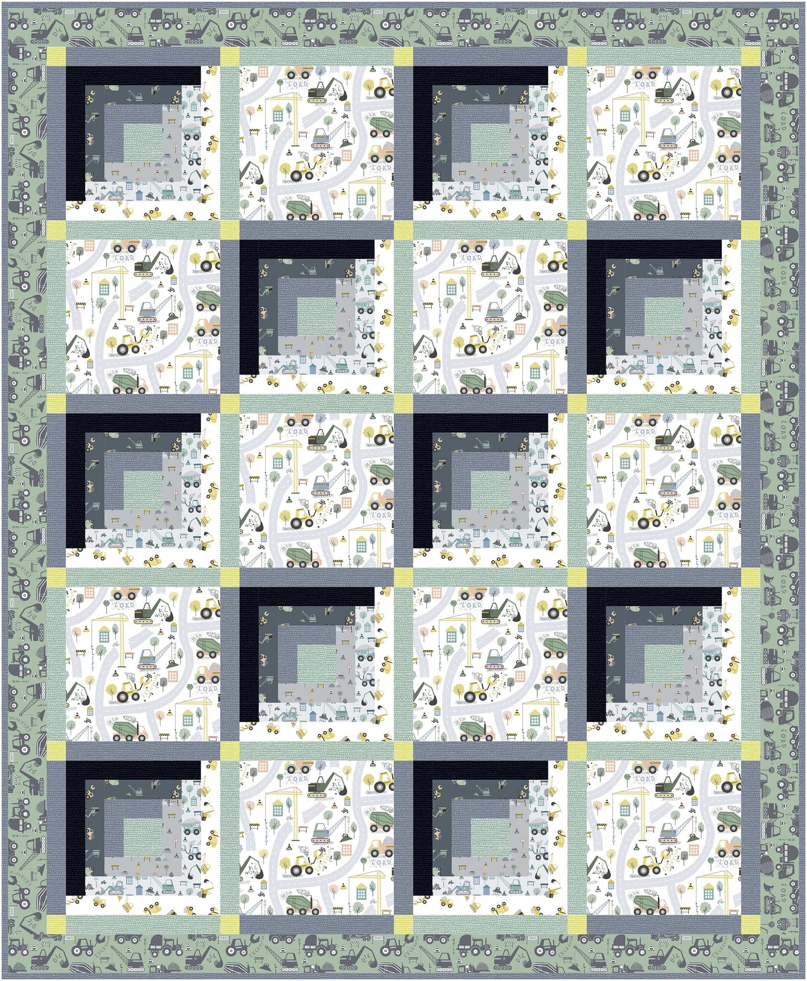
This is the magic of quilt gradients: you’re not just using different colors—you’re sculpting with light and shadow.
Landscape quilts are great examples of gradient quilt. This of earthy layers in a cliff, colored waves in the sea or varied foliage in a forest. It is the variation in those of light, medium and dark that provide depth.
Here’s how to add color fade fabulousness to your quilts:
✅ Pick a single hue (like teal)
✅ Build a gradient with at least 3 values: light, medium, and dark
✅ Arrange from light to dark across rows, blocks, or borders
✅ Use thread to echo the gradient with decorative stitching
✅ Check your values with the Squint Test
👀 The Squint Test (aka Your Old-School Color Checker)
Stand back from your fabric pull and give it a good squint. Yep—literally squint your eyes and blur the details. If all your fabrics blend into one hazy blob, your quilt might end up looking flat. (Your busy prints may also look a little muddy.)
✅ Can you still spot a light, a dark, and some in-betweens? That’s a solid gradient!
Even better: snap a black-and-white photo on your phone. This strips away color and shows the true value of each fabric.
- If two fabrics look identical in grayscale, they’ll blend together.
- If they stand apart, you’ve got contrast—and that’s what brings your quilt to life.
It’s like casting your quilt: make sure your stars and backup dancers are playing their parts.
Bonus Tip: Match Your Gradient to an Era 🕰️
Want a color story that tells time as well as texture? Try pairing your gradient with a nostalgic era:
🧺 1930s Pastels – Use tints like mint, peach, and butter yellow
🍂 1970s Earth Tones – Go for shades: rust, olive, chocolate, and goldenrod
💿 1980s Dusty Tones – Play with gray-softened mauve, dusty rose, and country blues
💎 1990s Jewel Tones – Use rich purples, emerald greens, and sapphire blues for high drama and contrast
Blend the gradient and the vibe, and suddenly your quilt is telling a story and looking fabulous.
If you like this discussion of color theory, stayed tuned for next month’s edition. We are working toward a beautiful surprise for you this summer~
Happy Quilting!

This is a great article. Thank you!